
Rewiring My Blog's Theme
Look around. Notice anything different about the site? If I've done my job correctly, your answer should be, "No, Nick. It looks exactly the same as it did last week."
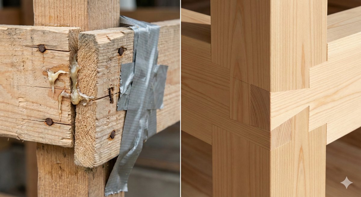 No hacks, just a perfect fit.
That's the point. Visually, my "Linen & Sage" design hasn't changed a bit. But if you were to peel back the wallpaper and look at the HTML and CSS underneath, you'd see a completely different structure.
This weekend, I decided it was time to stop patching holes in my theme's foundation and actually fix it. I tore out the old, tangled CSS and rebuilt the templates from scratch. Here's why I did it, why I skipped the trendy tools, and why my future weekends are now ruined.
The "house of cards" problem
When I first made up the HTML for this theme, I used Bootstrap. It's a great framework, but I found myself using about 5% of it and spending the rest of the time fighting its defaults.
Over time, my CSS turned into a house of cards. I was using weird little hacks just to get things to align correctly, and worse yet, everything was tangled together. I would change the font size on a blog post title, and suddenly the links in the footer would jump three inches to the left!
I really just wanted to get back to basics. I wanted to look at a piece of HTML, like a button or a card, and style it directly, without worrying that I was accidentally breaking the About page.
Why not Tailwind?
I know what some of you are thinking: "Nick, why didn't you just use Tailwind CSS? It's 2026!"
I thought about it seriously, but for this specific project, it felt like bringing a bazooka to a knife fight. Installing Tailwind locally meant adding bulk to the project and managing build tools just to watch my CSS file compile. The alternative of using their CDN link would have just slowed down the site load times, and ultimately, it came down to a desire for less friction in my workflow, not more tooling.
The great purge
So, I took the "solid case" approach. I adopted a standard naming structure (called BEM, for the nerds out there) that isolates every component. The header is now its own little island, so changing it can't possibly sink the footer boat.
Once I started cleaning up the structure, I realized how much other junk I had accumulated.
For example, I discovered I was loading the entire 79KB Font Awesome library just to display exactly two icons: the printer button on my guides and "hamburger" menu icon. That's like hiring a moving van just to deliver a single letter! So I deleted the library and replaced those two icons with tiny snippets of SVG code that live right in the HTML.
I converted images to faster formats, merged files to reduce the number of trips the browser makes to the server, and scrubbed every line of template code.
The result: A clean structure
The result of all this work is a theme that looks identical on the surface but performs radically differently underneath.
It is significantly faster, it has zero dependence on outside servers (CDNs), and it's resilient. Most importantly for me, it's a breeze to customize now because the code is clean, semantic, and organized.
It feels incredibly satisfying to run such a clean ship, but there is just one tiny downside.
I have two other blogs still running on the old, messy, hacky themes. Now that I know how good it can be, I have to fix those too. If anyone needs me, I'll be spending the next couple of weekends in CSS purgatory. Send coffee.